EH 102
May 31st, 2012
Diversity in a Single Story: A Comparative Analysis
Being a writer is a lot like being an artist. Before an artist creates a master piece, he has to first decide how to show case his idea. Will he paint it or sculpt it? If he paints it, what colors will he chose and what type of paint? Or if he sculpt it, will is be made of wood or stone? No matter what way is chosen, the artist is still trying to represent the idea he wants to create. And based on what medium he chooses, different feelings or vibes will be felt by the viewer. A writer can choose to write a story like how Kafka wrote “The Metamorphosis”, with a great amount of detailed paragraphs with a indifferent attitude, or a writer can write a graphic novel version, like Peter Kuper did. They both wrote the same story, but had two very different styles. But how can a simple choice like writing a graphic novel or just writing a short story have such an effect on the overall feel of the material?
 When a reader reads a story, one of the first things they pick up is an author's tone. But what is tone? According to the City University of New York's website, tone is “the writer's attitude toward the material and/or readers. Tone may be playful, formal, intimate, angry, serious, ironic, outraged, baffled, tender, serene, depressed, etc.” The attitude, or tone, in Kafka's original is very somber, dry, and lacks the excitement you would expect from someone who has just turned into a large insect. All Gregor says when he awakes as a large bug is “What has happened to me” (Kafka ch.1). Kafka then goes on to write a long, over drawn paragraph about Gregor trying to turn on his side to get comfortable and not succeeding. Kafka's writing style is over detailed and wears down on the reader. By choosing this writing style, Kafka creates a story which has a very apathetic tone, and intentionally boring. Kafka's goal was to make something usually outrageous, into something seemly normal that the everyday person might go through. The graphic novel done by Kuper is more "animated" and has more emotion. The writing style that usually accompanies graphic novels is meant to excite and be straight to the point. “The Metamorphosis” begins to go through its own changes as it's long drawn out paragraphs becomes pictures and speech bubbles. Faces are now seen in the pictures rather than imagined. When Gregor awakes as an insect, he appears to be shocked and terrified as he exclaims “w-what's happened to me?” (Kuper 2). Gregor trying to get comfortable in bed and turn on his side becomes humorous. Though both authors are telling the same story, their chosen attitude, or tone, changes the over all feeling for the reader.
 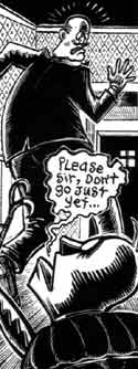 Kuper's and Kafka's difference in tone is not the only thing that differs in these two stories. There is the obvious medium choice the authors wrote the story in. According to Rachel Marie-Crane Williams in her article “Image, Text, and Story: Comics and Graphic Novels in the Classroom”, “Empathy is one of the most important topics generated by this type of material. Art allows viewers to step into the eyes of another and consider a different point of view.” (Williams 4). Suddenly, Gregor has a face, and with it, the reader can connect to him and his situation and feel for him. Illustration are easier to relate to because we are use to seeing emotion in peoples faces and body language rather than reading it. Janet M Beagle of Purdue University did a study on "Pictures versus Text" where one set of people studied pictures while others studied text, then were ask questions relating to what they studied. According to the study, “Pictures had an advantage for recognition but not for comprehension .” (Beagle). It was easier for the people in the study to memorize pictures and then answer questions about them, but those who studied text comprehended the subject better and could transfer that knowledge to other things. Though pictures are easy to relate to and recognize, text offers details that can not be easily shown in an illustration, and offers the reader better comprehension. So a reader can gain the ability to relate to characters and situations, but lose complete comprehension in graphic novels, or a reader can skip the easier emotional connection and opted for a better understanding of the material in straight text.
But, alas, Kafka's writing style could put the reader at a disadvantage. According to a study done by the A.A.M.C, “Those receiving the short, less detailed form scored the highest on comprehension (67%); those receiving the medium length form scored the next best (45%); and those receive the long form scored the lowest (35%)” (AAMC 8). Kafka's long, drawn out story, could lead to less comprehension. Having to analysis a large body of text is harder than reading a few speech bubbles and short sentences. Having less material to read could lead to a better understanding of the overall point of a story.
The same story can be told in many different ways. Each way has its own advantages and disadvantages. It is up to the reader to find which way they like best. Some might like reading a good book while others relate better to the style of a graphic novel. A writer can add their own emotion to a story , therefore creating something new and original. They can choose to write a longer detailed story, or one that is short and to the point. What ever a writer writes, or a reader reads is up to them. With out that diversity, story’s and literature would be boring and uninteresting.

Work Cited
“The Metamorphosis” Sharesnack, Kuper, Peter. ‹http://www.sharesnack.com/5DFEAEEC5A8/fzk5ejn1›
“The Metamorphosis” The Literature Network Kafka, Franz
I do not agree with your comparative analysis. I was really mixed up while reading it, and I could not tell if you were comparing in your analysis. In addition, you did not include points or items that indicate that you are comparing the comic and the story. In my own opinion, you were just analyzing what you felt about the comic and the story without showing that you are comparing them. All the same, you tried because it is really a complicated study to work on.
ReplyDeleteJohn, although I did not read the graphic novel, you did a good job of letting me know the key points. Also, just looking at the structure of your analysis you constructed it very well. You started your introduction off with a hook and stated your thesis, letting me know what you’re comparing. You also introduced your quotes very well and gave hyperlinks so I could see where you pulled your information from. Over all good job.
ReplyDelete